SIMOLIVE Branding
Logotype, Branding, Corporate Identity, Packaging
The briefing:
SIMOLIVE Branding
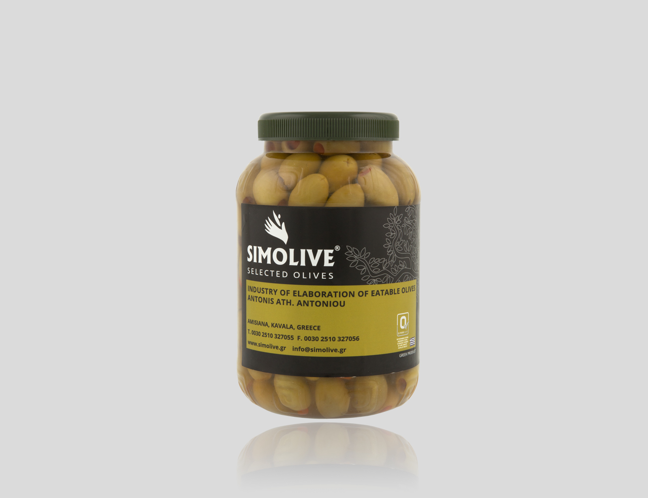
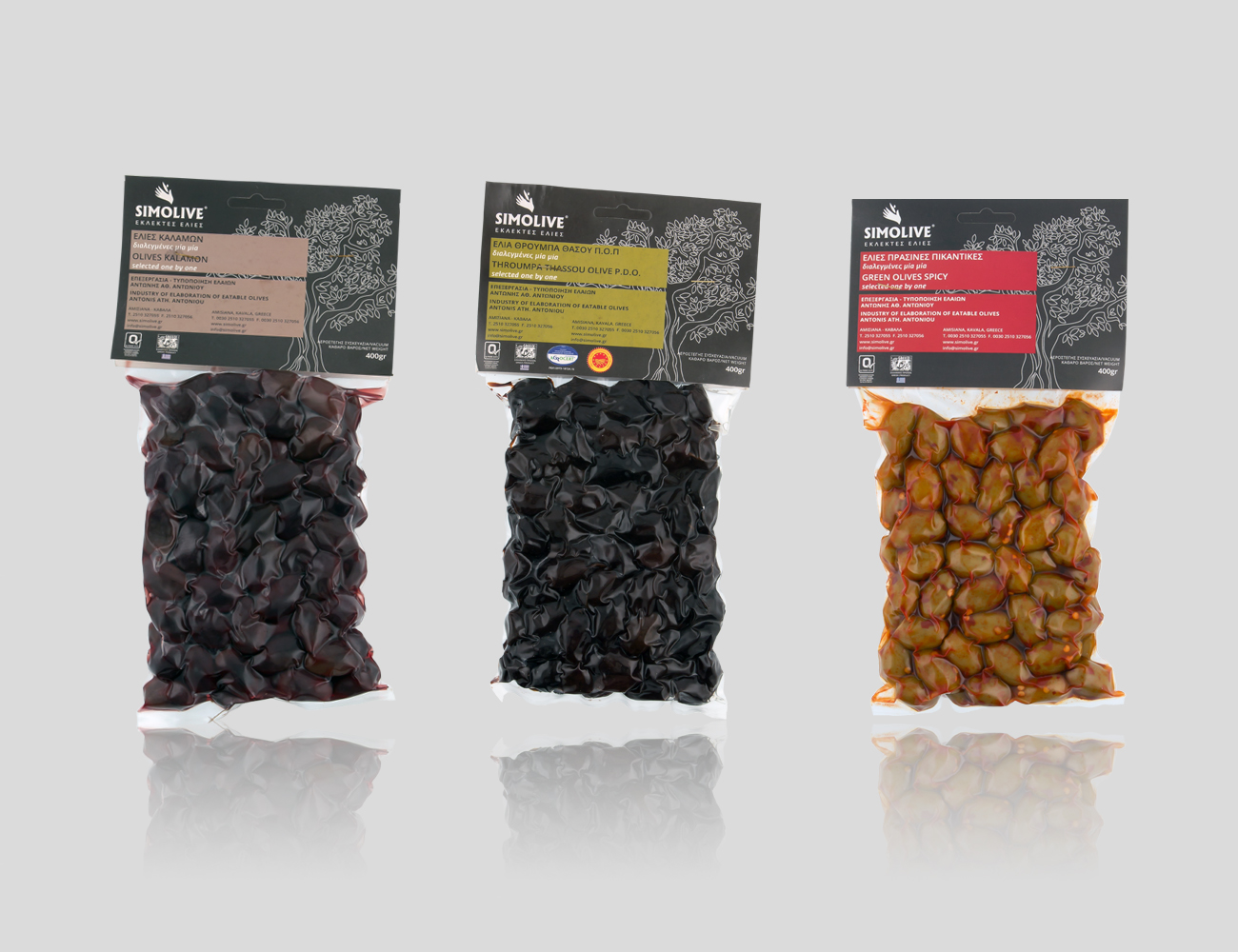
Simolive is a company that specializes in the processing of the olive, and entrusted Karotto™ for the design of the whole corporate identity.
We based the concept of the identity on the product itself, the olive and the process the company follows till the final result. For the logo we created the hand that collects the olives from the trees in a modern and minimal design while for the typography, we chose strict geometric lines. The main color palette is green, as a reference to the olive trees. Using the logo and the green color we designed the corporate image and the packaging following minimal structure and geometric patterns.
-

Simolive Logo
-

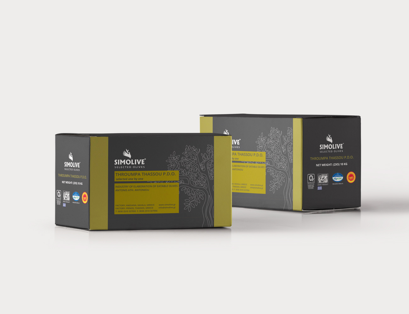
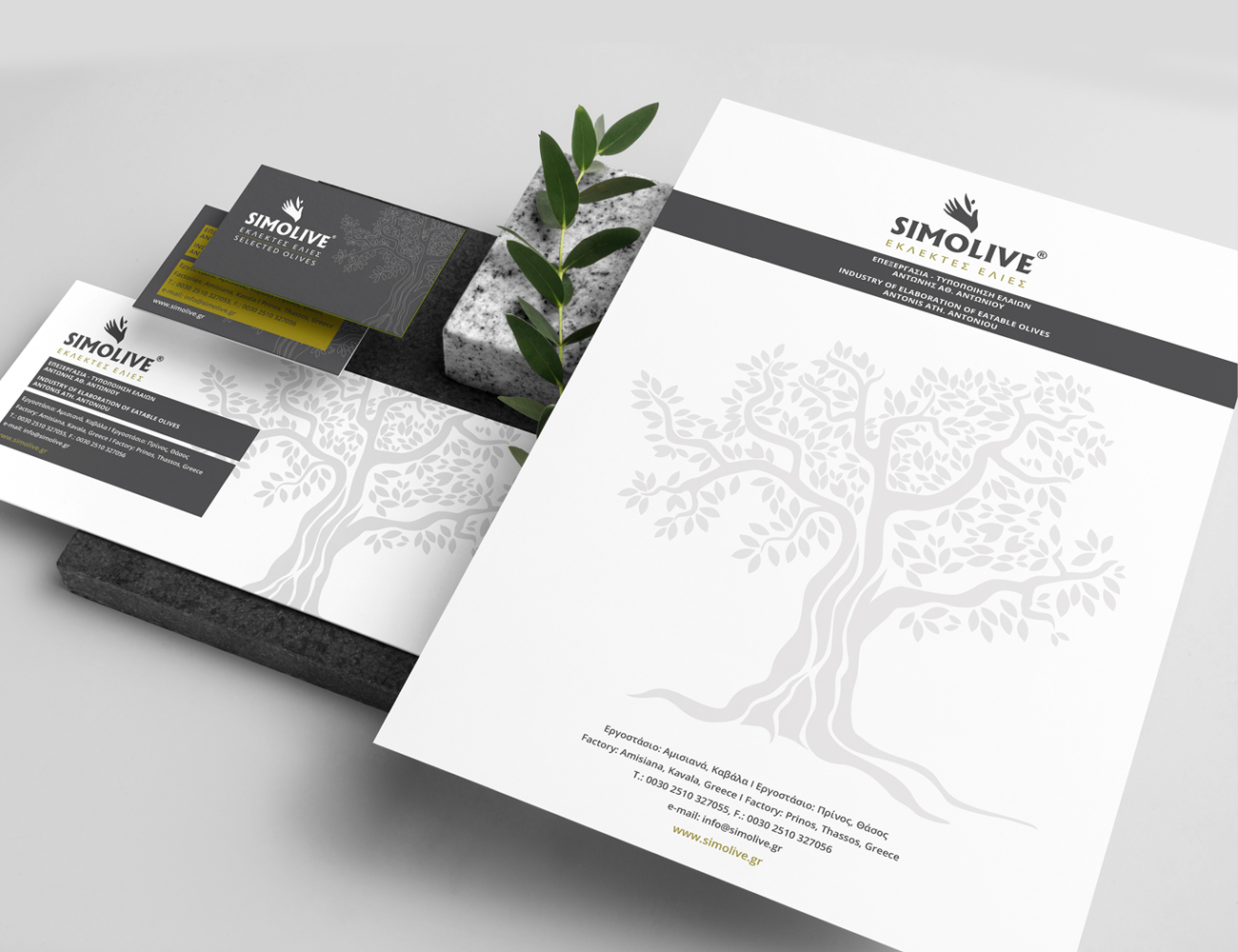
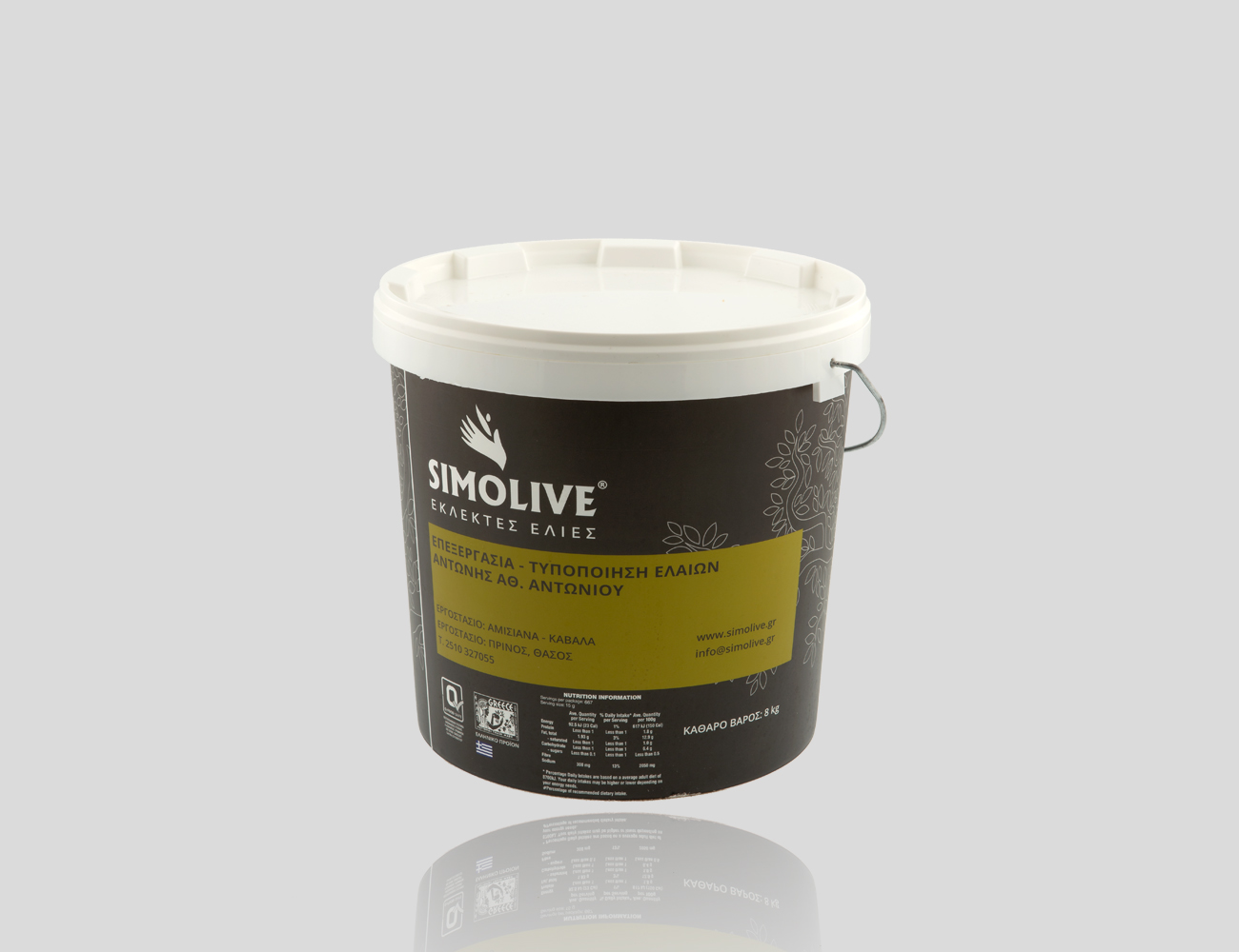
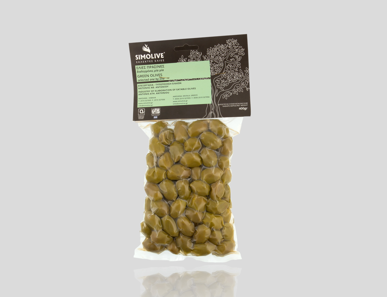
Simolive Packaging
-

Simolive Packaging
-